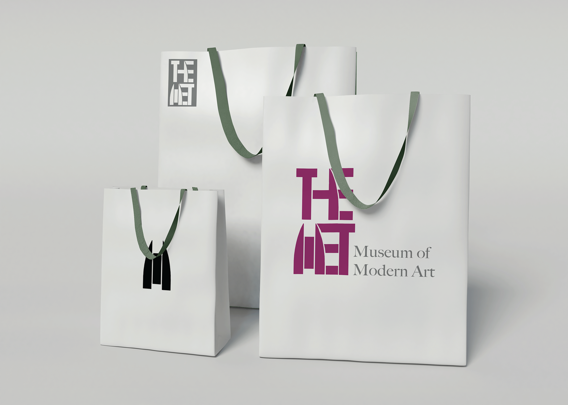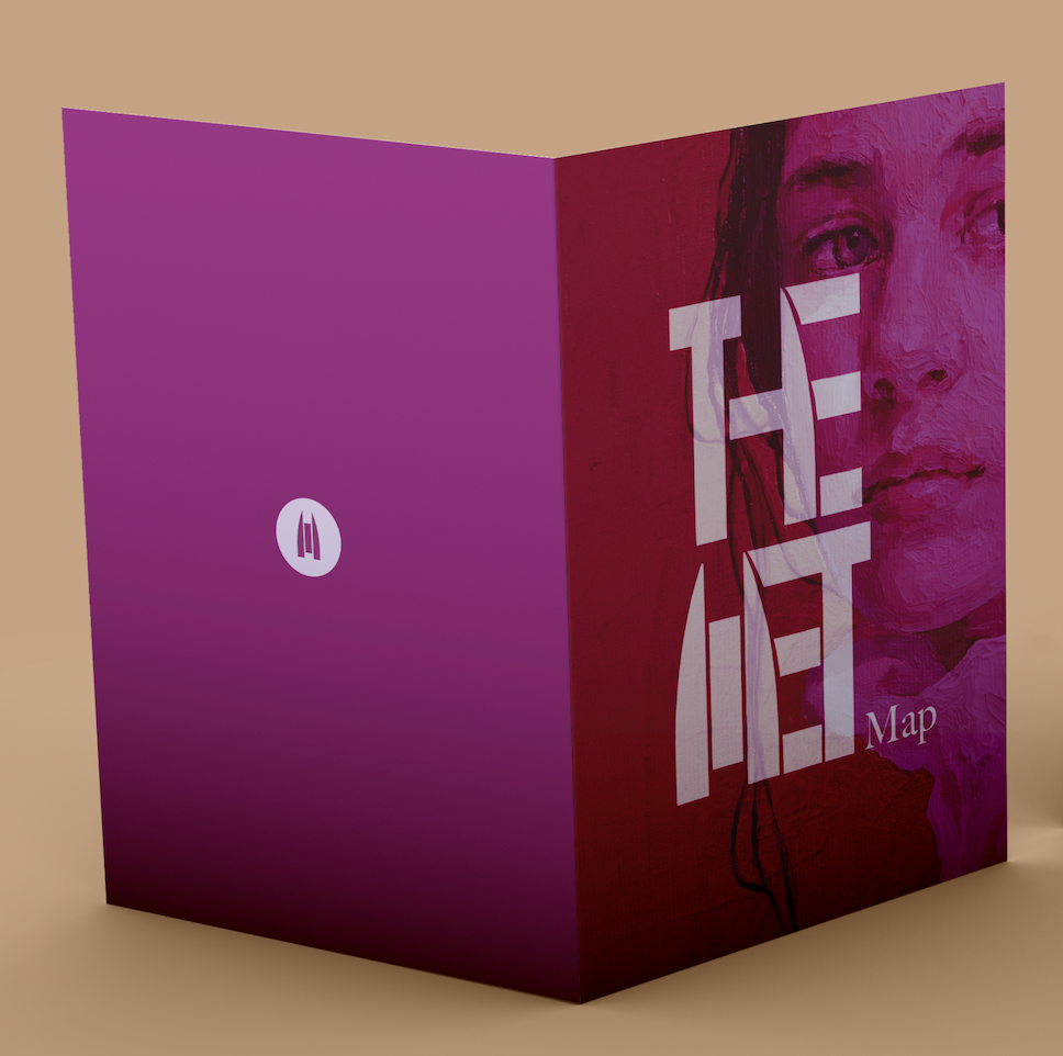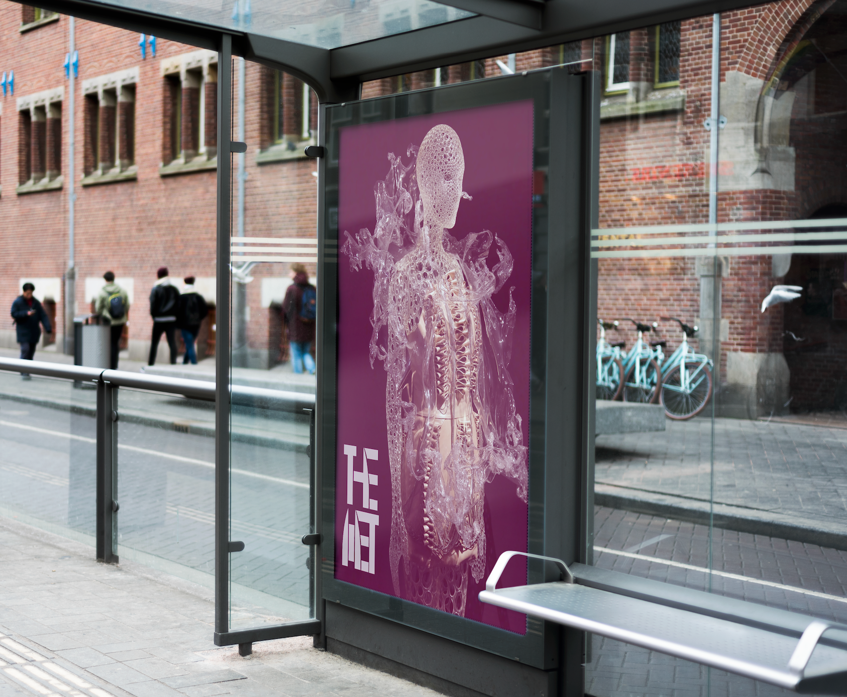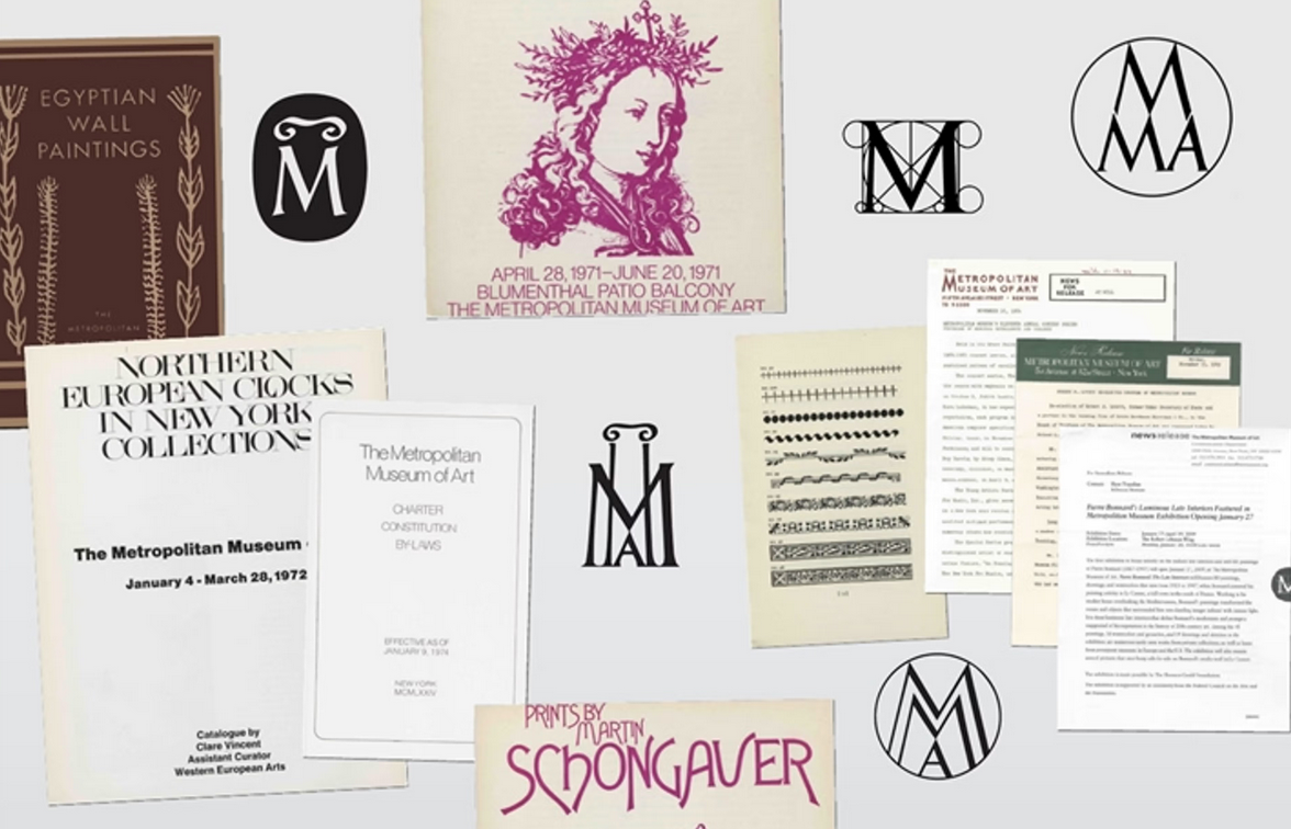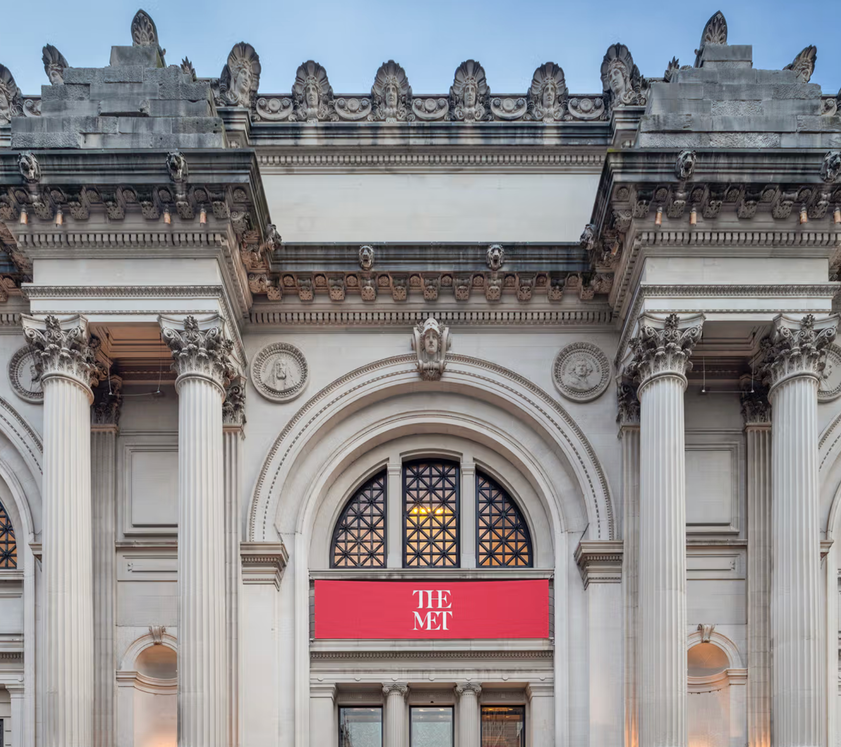
A rebrand of The MET was developed by drawing inspiration from the institution’s history and architecture. Research revealed that one of the museum’s original colors was a maroon shade, which was reintroduced into the palette to honor that heritage, replacing the current red. Archival materials also showed extensive typographic experimentation, leading to a study of the building’s iconic windows. These windows became the foundation for a custom typographic treatment, with the ‘M’ in MET designed as an abstract interpretation of the window shape.
To ensure versatility, a fully responsive logo system was created, ranging from large applications to small icons, all easily recognizable as part of a unified identity. This rebrand pays tribute to The MET’s legacy while presenting a modern, cohesive visual system.