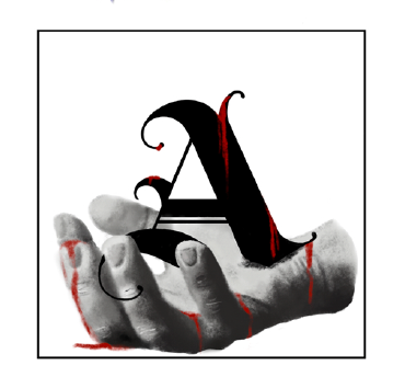
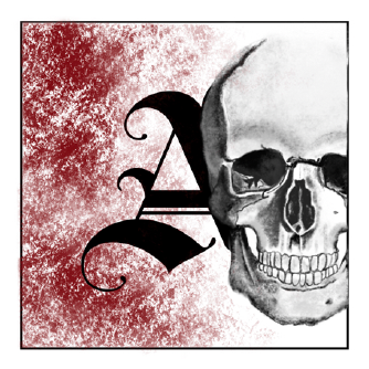
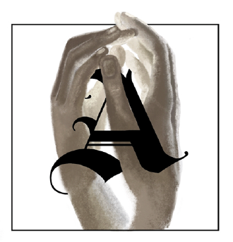
Typography plays a significant role in everyday life, making it essential to keep it innovative and creative. In a sophomore studio course, a series of illustrated initial caps was designed for an edition of Romeo and Juliet that was typeset by hand. Each design was hand-drawn in Procreate and incorporated visual themes from the corresponding chapter into the artwork.
The goal was to merge typography with storytelling, creating decorative initial caps that not only marked the beginning of a section but also reflected the mood, imagery, and symbolism of Shakespeare’s text. Inspiration was drawn from traditional initial caps found in Medieval manuscripts, with the intention of ensuring that each illustration worked seamlessly with the letter itself.

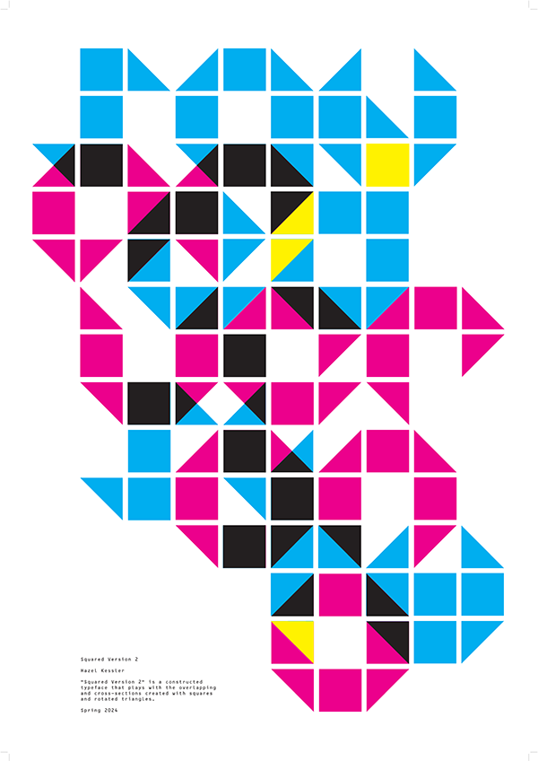
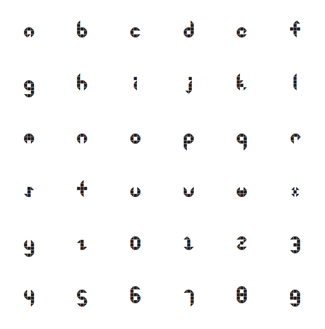
These images showcase a complete typeface designed using a custom grid system I developed. Through studying kerning and letterform relationships, a constructed script that intentionally pushed the boundaries of legibility was created. To further explore the typeface’s visual possibilities, I produced the last poster, which features an abstracted rendering of its name, “Squared Version 2.” This project introduced the software Glyphs.
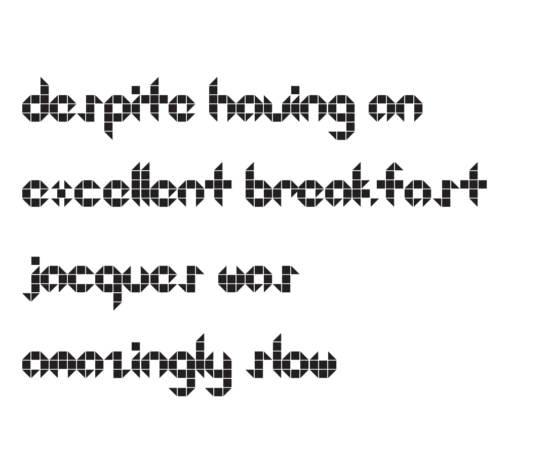
Pangram
